How do you build a brand from nothing? how do you conjure something fresh, exciting and eye-catching from nowhere? Create a new name, icons, imagery, patterns, packaging, website and adverts all that look on point, have something new to say and reach their target demographic with ease, where do you begin?
To build a brand you start at the start, what is it, who is it for and what's special about it? you don't start with the images, or the glossy visuals you start with an idea formed by insight. In building Joya, a new brand in a virtually new sector (the bed in a box brand), we really started with the brass tacks, examine the product, examine the market, examine the competition. Most people who market beds do so with people sleeping on them, seems logical right? but in reality it often looks dead! in our research we had uncovered the vast amount of information there was on the multiple health benefits of a good nights sleep, we decided we would focus there. Everyone knows what a mattress is but our angle would be not a great nights sleep, but what a great nights sleep would do for you, it sets you up for an amazing day ahead. The bed in the box product area, is relatively new, its usually sold entirely online, so the target demographic is normally younger, product focussed around wellbeing aimed at a younger audience! perfect, there was a lot more to it than this, we broke it down even further than this and we broke it down by country and region, but this is just to provide a flavour.
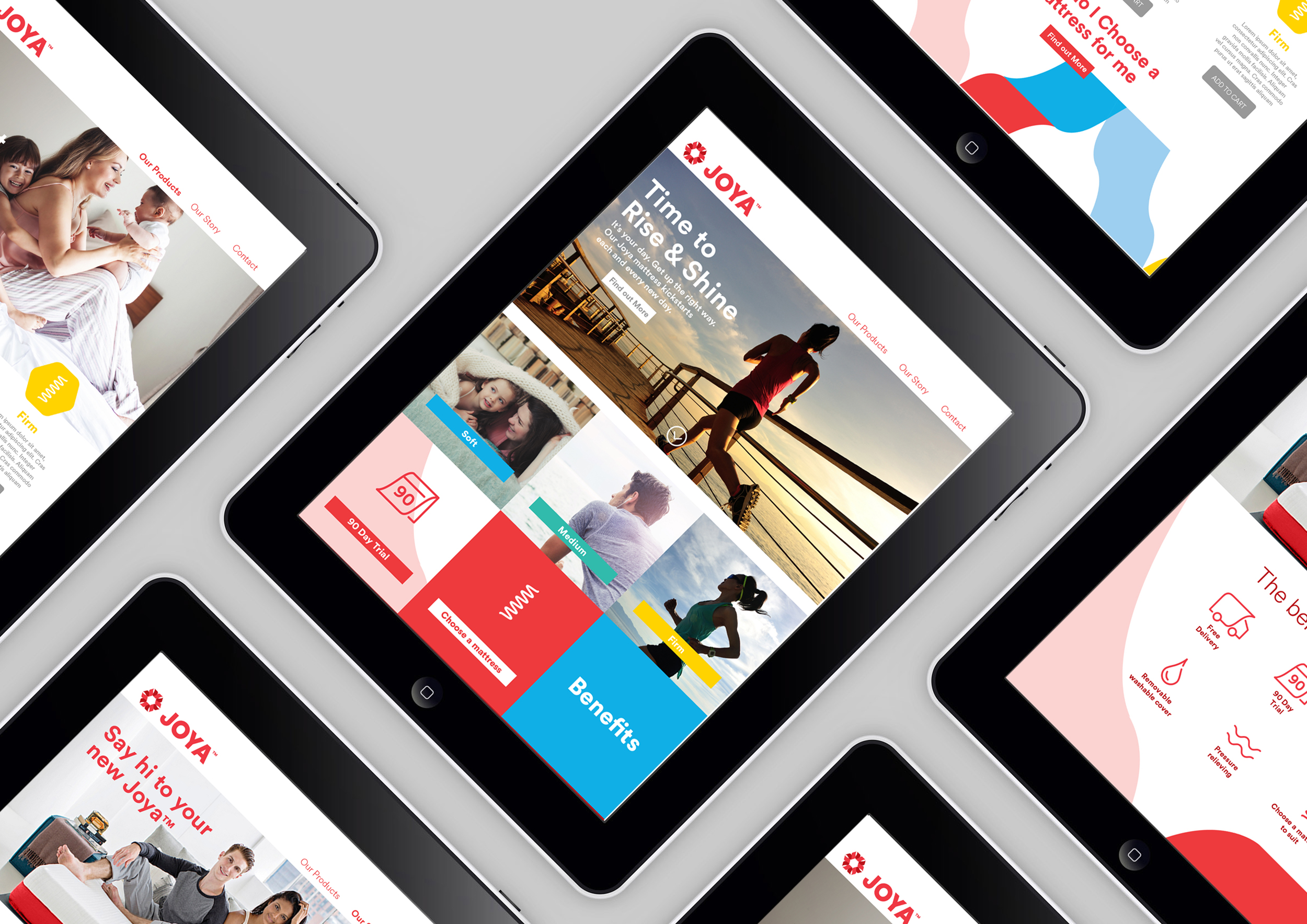
Next up naming, we created suitable naming territories based on the insights and requirements we had uncovered. The new name had to evoke the sense of a bright day ahead, the benefits of being well rested that you had that joie de vivre, we also needed a name that could be used Europe wide and finally be trademarkable. Through our own unique indepth process we created the name Joya, short, meaningful, memorable and very eyecatching in this space.
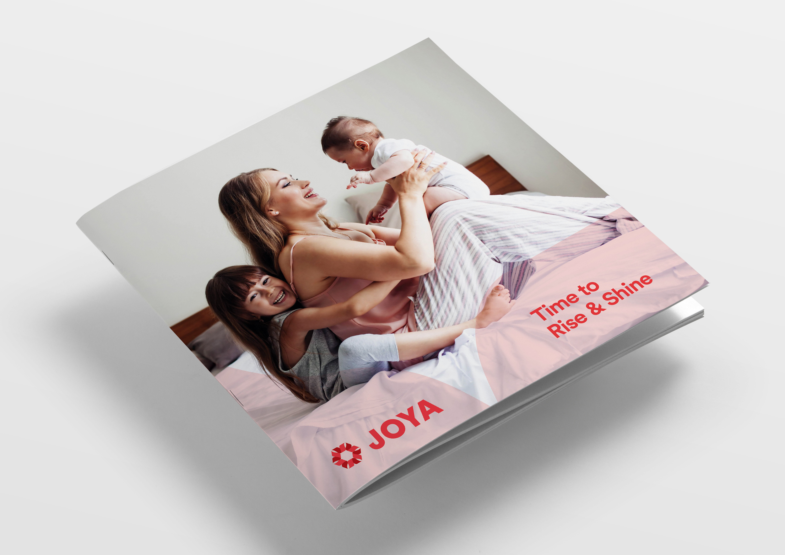
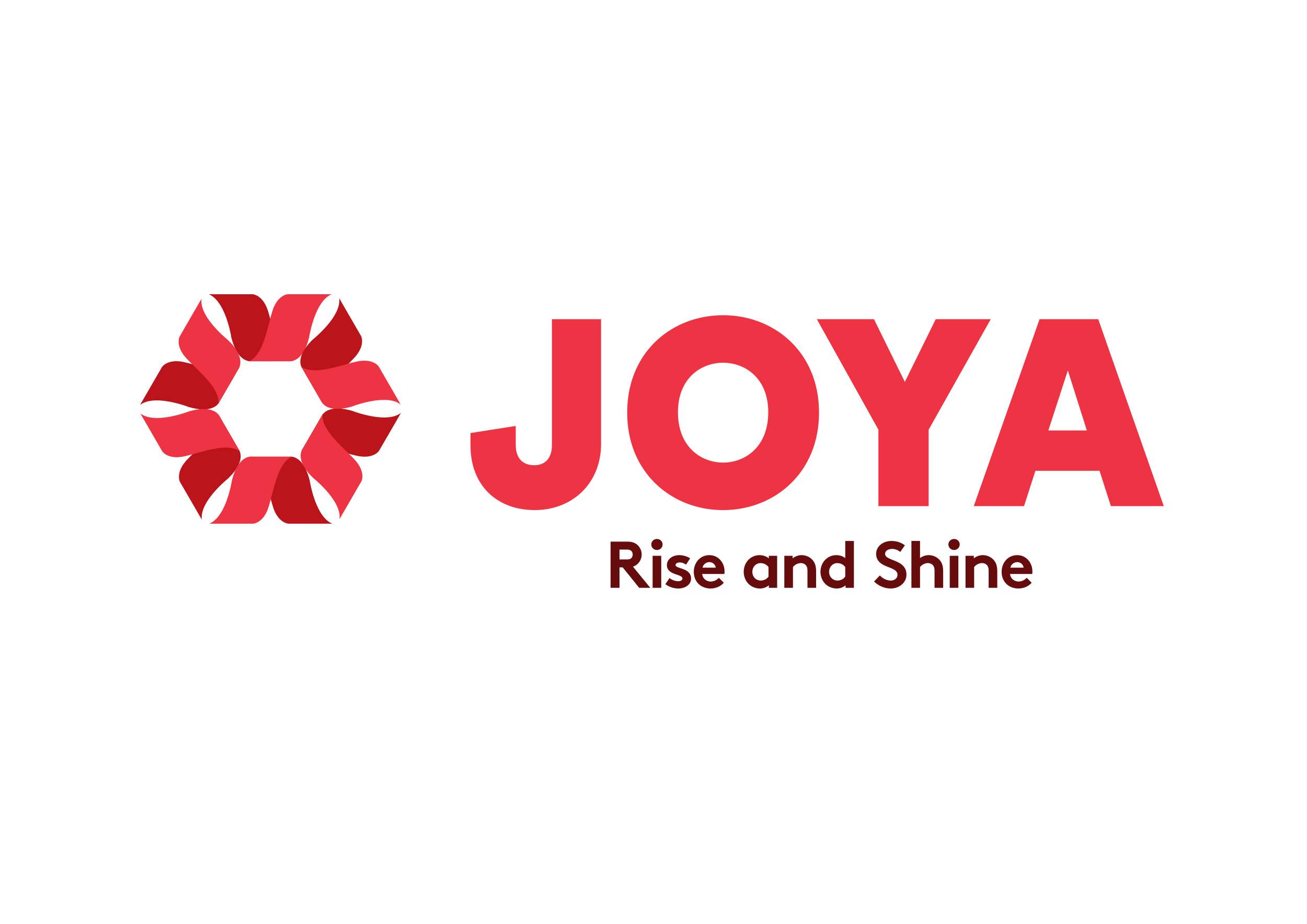
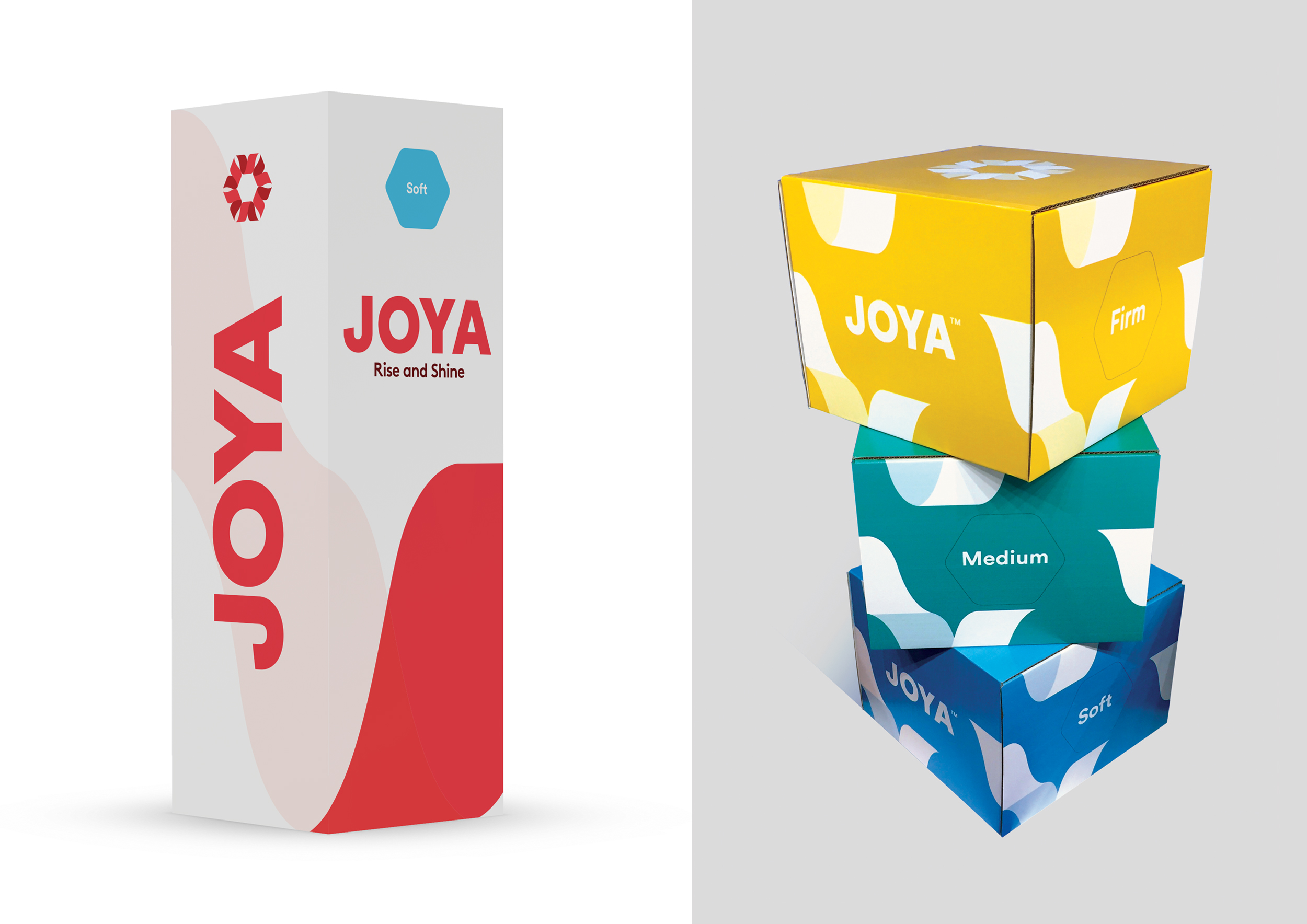
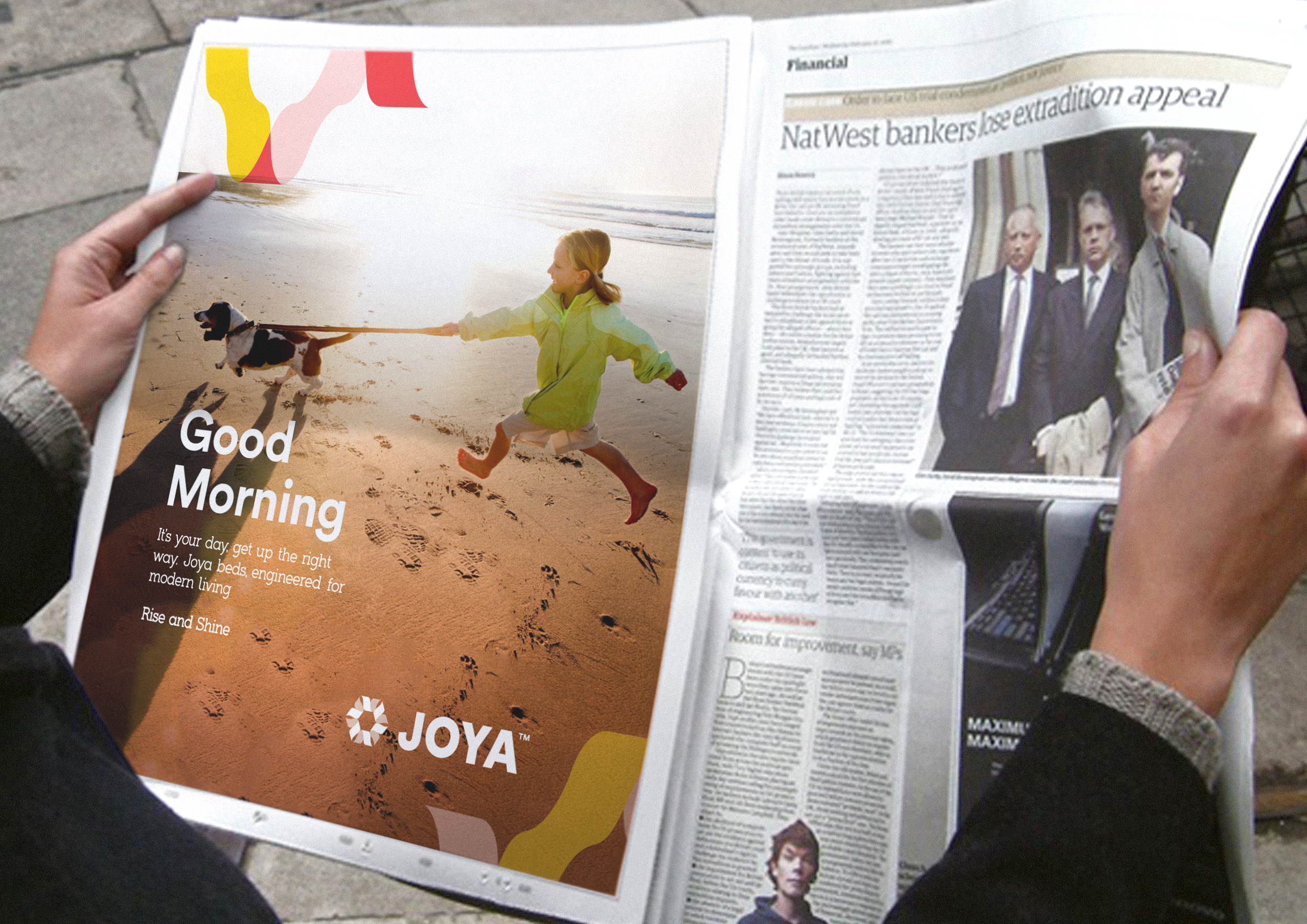
In creating the visual language we wanted to create an identity system that was as happy on product as it would be online, patterns for fabrics as well as for adverts, colours that evoked a bright day ahead. We also wanted to create an icon, a ray of sunshine that could be used both on its own and as part of a logo, a fresh, flexible and energetic system, with photography that was all based on the best morning, be it the morning run, up with the kids, a fresh stroll or that first coffee. We underpinned it all with the simple line Rise and Shine.
The simplicity of the outputs hides the huge depth of research and analysis that went on underneath, but it is this researched filtered by an idea that creates the platform for success.